Grubhub & Seamless Email Creative
-
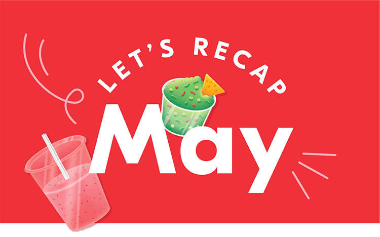
In 2019, Grubhub was evolving its look and feel. We landed on a concept called “Food in Motion” which communicates food, delivery, speed and fun. These key aspects of the brand needed an ownable and scalable way to come through in our email creative.
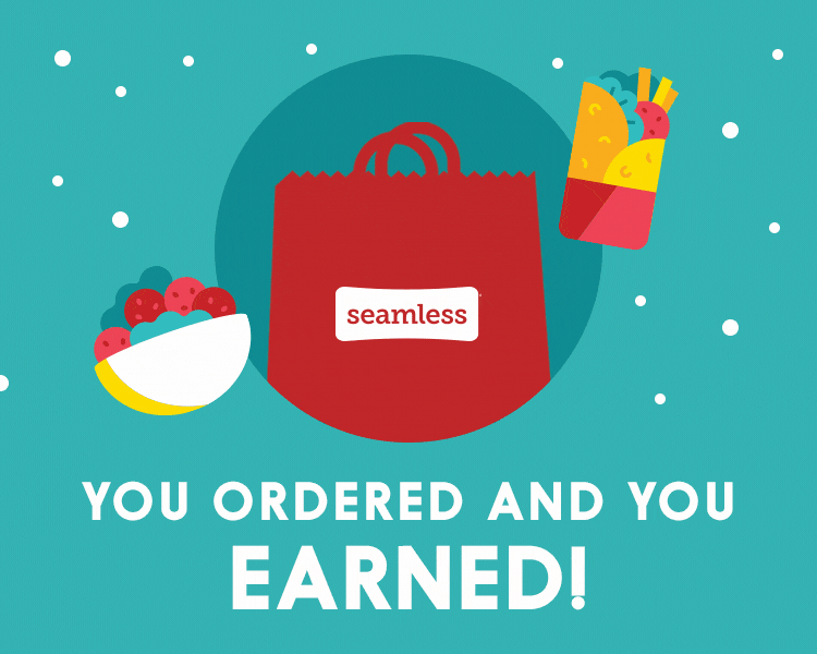
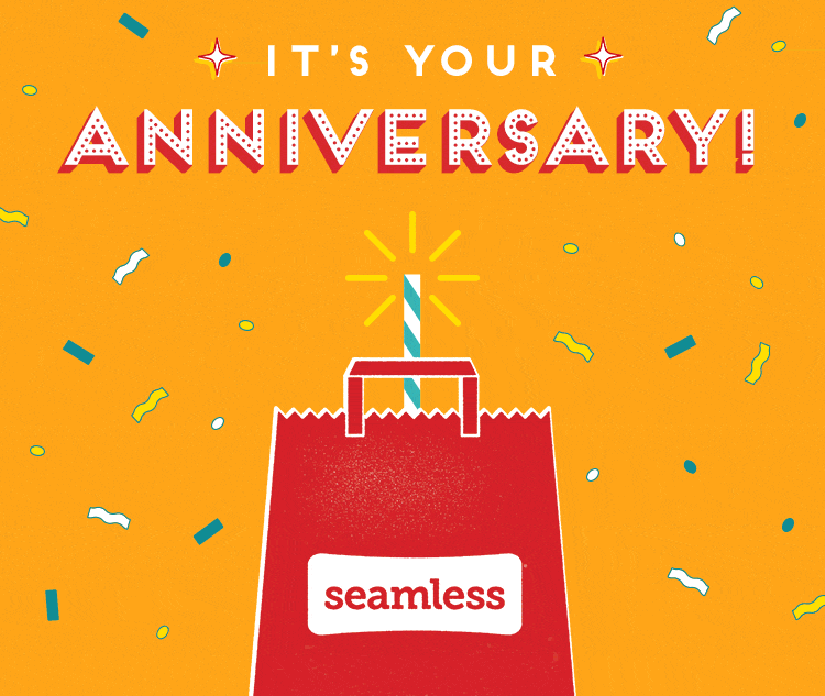
Simultaneously, Grubhub needed every piece of email creative to be crafted again in the style of Seamless, their sister brand with its own recognizable visual identity, often seen across New York.
-
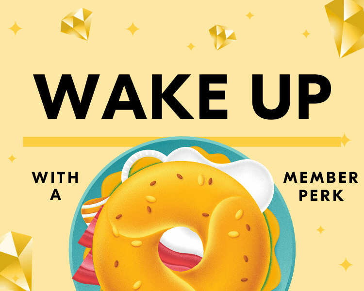
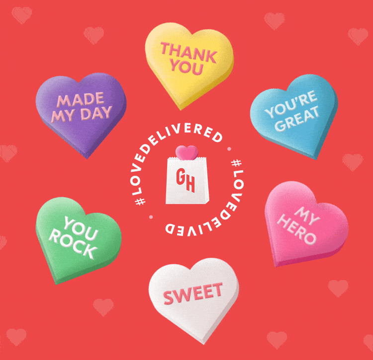
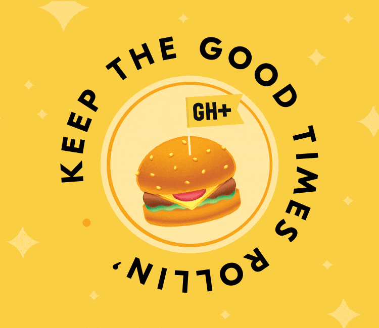
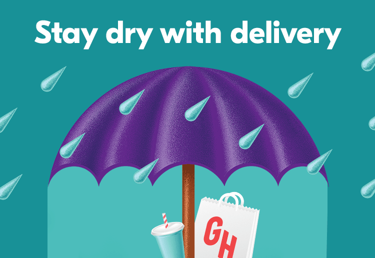
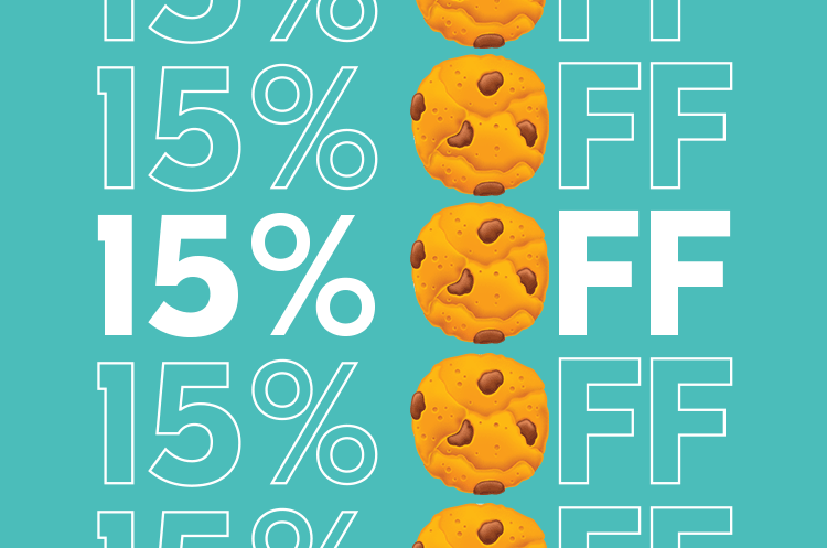
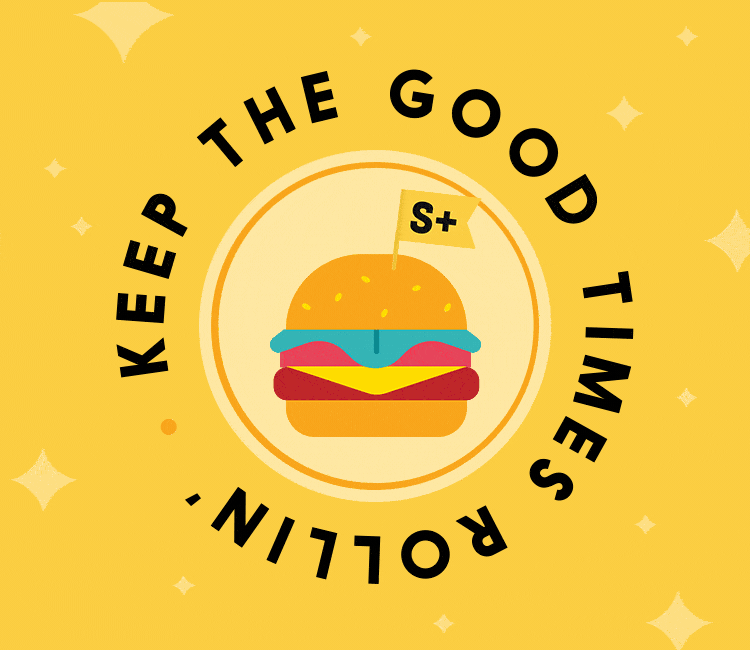
I crafted the below email header creative and broader design system for both brands to feel bold, bright and swift. For Grubhub, I leaned on textured food illustrations, punchy type treatments, motion lines, and subtle animations to communicate liveliness.
For Seamless, I narrowed in on their classic, bodega-inspired color palette and typography, keeping the look true to the brand that New Yorkers know and love.Both approaches were implemented across our in-house team, creating more brand consistency and higher email open rates.
-
Creative Directors: Jeff Deibel and Sean Donohue
Art Director/Senior Designer: Kaitlyn Richert
Copywriter: Hank Green
Illustrations: BBH NY2019-2022